Saturday, August 31, 2013

Telling the story


I missed posting the painting I did last week. Well, actually I forgot to take the pictures of the process and then forgot to post it! Guess that is what crunch time on research papers will do to you!

Anyways, here is the photo I chose to work from. I took this photo from inside the "playhouse" at Boldt Castle. The playhouse sits almost directly on the water and is a beautiful structure (even if still a bit in need of repairs).

Now, one thing I learned about through my readings was the importance of telling a story with your art. The doorways at Boldt were very appealing to me that day. Doorways are both entrances and exits. You move through them into different spaces, and in this instance different worlds. The interior of Boldt Castle has been remodeled to resemble the era that George Boldt lived to "feel" appropriate for the times. Therefore the inside is of one era and the outside is the trees, flowers, and water of today.

This doorway itself was beautiful with its round window and streaming sunlight. The bright water outside set against the dark interior and the smooth polished glass with the rough stone were beautiful opposites. I felt this picture alone spoke of hope and promise for this place that was abandoned after a tragedy.

The little windows on the sides were a bit of a distraction. A painting is supposed to enhance the image, not be painted completely from what is seen. Make it better, bigger, brighter! Art does not have to copy life, just enhance and bring out the beauty and story of life.

So without further chit chat from me, here is what I came up with!

Tuesday, August 20, 2013

Romantic Boldt Revised

Okay, so back to the Romantic Boldt Castle painting. First the issues and then I'll tell you how I went about fixing them.

The issues. First here is the reference photo I used for the botched painting:

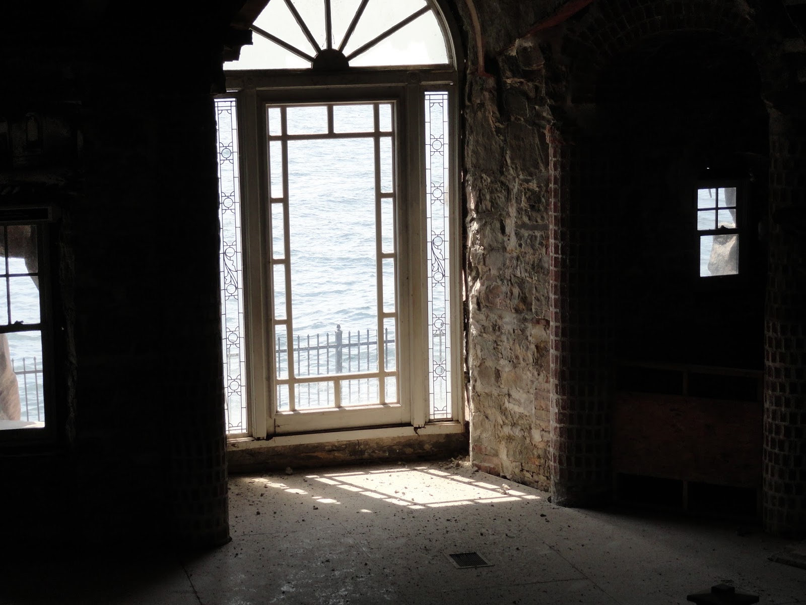
Not bad right? I thought so too, and no its not a bad picture nor a bad reference. However the perspective on this one is a bit more "intense" than some of the other pictures I have. Here is the picture that I used for the second reference:

Yea, I know it doesn't look much different does it? However, notice the middle, where the focus is going to be. Notice how the lines for the windows and the ledges/rooftops are more slanted in the first picture than the second? This is the lines of perspective that make it "look" 3-D. Typically this doesn't present a problem, unless you sketch it wrong:
Now it looks like the buildings are "falling" to the left instead of going off into the distance. Mistake #1! Here is where I realize that often using a tool is sometimes helpful in making your sketch correct. In the corrected painting I plotted the points and used a ruler to make the lines work with each other instead of making the buildings fall over. (yea, forgot that picture!)

Now, I liked the look of the first one without the 'ugly' boat in the front and stuff. so we have to crop the second photo to resemble the first.
 
Okay so now we have the picture. Now where else did we go wrong?
Well do you remember from the first Boldt painting how we chose two complementary colors to use and only used these to paint the whole painting? Here is where color choice can be very very important. I had a great idea in mind of what I wanted to say with the colors, the light, and the subject of the painting. The story of George Boldt and his wife is a very romantic, yet tragic story for his wife never got to see his gift to her (he had the castle built for her but she died before it was finished). With the colors I wanted it to resemble a sunset (like the sunset of their love with her death) but yet full of soft pinks and reds that would immediately bring to mind romance.
So in the first painting I chose red and green, thinking I could get a reddish gold color to the building that would resemble the reflection of the setting sun.
 
 
If you notice, I also put the horizon (where the building meets the sky) up into the top half of the painting. I wanted it to look larger than life. This also forced me to bring some of the highlights into the trees more into the red/light color category so that the building doesn't get blocked nor seem like its floating in space. It is necessary to anchor the subject so the viewer moves into the painting smoothly, not feel out of balance when looking at it. So here I brought the trees in the front of my focal point (the windows and tower) more into the light. They were supposed reflect the light of the sky similar in color to the building.
 
The red here is my light color and the green my dark. Unbeknownst to me, when you mix certain reds with certain greens you get a very purple color! Yea, I was unprepared for that. Notice the dark purples in the building? Yea, I didn't expect nor anticipate that.
 
So, here is where I made my second mistake. Seeing the purples and the reds and greens, I thought I should add more yellows and oranges to the painting to bring out more of the "sunset" look I was going for. I should have stuck to my guns and kept the colors I was creating, using those to their fullest instead of second guessing myself.
So, now that we have covered the oopsies, lets see how it turned out after I reworked it.
 
Yes, I started with a fresh canvas and redrew the painting using the second reference. Notice here the buildings don't look like they are falling over. This picture still has some of the "lines" a bit off, but that was work in progress so it happens!
This time I stuck to the strictly red and green colors I chose the first time. I embraced the purple instead of trying to counter it. The sky doesn't look it so much here, but the upper left is actually quite dark greenish. Also the building is very pink. I still had a few "rewrites" with the main focal point, but that will happen.
Here we lightened it up and warmed it up a bit more. The first pink was a bit too cool of a color to look like it was reflected from a setting sun. Remember, that is the other look we are going for, though this time I tried not to focus so much on it. I tried to remain more "romantic" feeling than sunset. If the sunset happened it did, if not I still got some of the romantic vibe I was going for.


The lines are matching up better and it doesn't look so "off" now.
 
Started adding in the trees. Now, my focus was to have dark trees on each side with a sort of path of light in between that "points" to the focal point. Yea, these trees were "green" mostly with some red here or there, just somehow it all turned purple! Interestingly this adds unity to the painting for all the colors are of a similar make up. Even the pinks and light greens are varying shades of red and green mixed together.
 

Okay so here we can see the bright reds going up to the building. There are reds and pinks throughout that cause the eye to move through the painting, while the focus sits mainly with the front of the building and the tower. This makes for a visually pleasing piece.
 
And here we are. In this last one you can see the greens in the sky a bit more. Also with the intense darks and bright lights it does look more like a sunset type. The front of  the building is the lightest part which also draws the eye.
 
Fairly Romantic don't we think? The first painting has some flaws that might be fixed at a later date. The color combination is not a bad one, nor is the perspective that far off. It is, unfortunately, extremely difficult (at the stage I am in, others might not find it this way) to "fix" these in a wet on wet technique. So, since I'm not afraid of making mistakes and starting over, we'll put it away to dry for now and maybe revive it at a later date. At this point I wanted to create the idea I had in my head for the vision and story is more important to the failures and attempts.
 
I hope you enjoyed reading through my process and seeing the final result. Next week we'll go through another idea, tell another story, and try something new! 
 

Saturday, August 10, 2013

Leaning Mistakes

Okay, so early in the week I commented on my Facebook page about doing a romantic Boldt Castle painting. I had a glorious vision of sunsets, pinks, reds, and a stately castle carefully and meticulously rendered on a larger canvas. Unfortunately sometimes mistakes occur!

I will save the lesson of the mistakes for next week. I fully intend to revisit this vision, for I believe it to be a grand one with a great story, but without the mistakes! So next week we will talk about some of the things that happen and how you can learn from your mistakes.

Instead I will share another walk through on a piece I did earlier this week. I find lots of inspiration from Deviant Art and the artists there. This is where we start, with the inspiration.
My inspiration was these:


(Both are from Deviant Art the first one by:                         the second by:                       )

Okay, so I liked the colors of the first one. If you notice, they are already in a complementary color scheme. You have orange and blue mostly in this. I also loved the idea of light littering the ground and making the leaves light up. However, I wanted to use the bottom photo as my actual composition with a few adjustments for I like the path ending in light concept.

Here are the adjustments. First, the composition photo is too centered. The path and focal point is too much in the middle and remember last week, we said this is bad because it divides the painting in half. It is also quite boring and we don't want to be boring. So lets move that point over just a bit to the right to make it off center.

Here is my sketch of the initial composition:
 
I brought the trees forward a bit and you can see the right hand side ends at that dark tree on that side of the picture. I actually cropped the picture before sketching so I could remain on target. It really is too easy to get off track when sketching it out, especially with all these trees!
 
Since we are going to use only the blues and oranges in order to capture the look of the first picture, I used acrylic paint to put in some of the lights and darks to guide me. My focal point is not going to be the distant "white" light at the end of the path, but more like the pile of leaves to the left of center. I want my viewer to fall into those leaves! The path and the colors surrounding the viewer will pull them throughout the painting so that once they fall into the leaves they can get back out again without difficulty.
 
 
At this point we need to discuss something that is very important to this piece and that is atmospheric perspective. When something is farther off in the distance, though it be a tree, bush, house, etc. often it will look more "blue" and often lighter than you'd normally expect. This is because of atmospheric perspective in that you are looking at it through the atmosphere. You really get a great example of this with fog, for you are looking at things farther away through the clouds that are laying low to the ground and therefore things look 'foggy'. Well regardless of what time of day it is or what conditions there are outside, you are always looking at things far away from you through some sort of atmosphere.
Therefore, the trees in the distance in the picture look fuzzy and lighter than the trees next to the photographer. This has to be painted in a similar manner or else the depth of the painting will not be realistic enough.
So to get this look correct, we should start there first.


Notice all the trees in the background are blurry and blue/grayish. Even the leaves are duller, for you would not 'see' their vibrant colors until you were much closer to them. This gives our painting a bit of depth and you can follow along the path to wherever it ends.


I carried the blue/gray all the way through the background for the forest does not end with these few trees. You would see multiple trees in the background and it might go on for miles. However, to keep the viewer focused these trees need to be out of focus. Instead I want the viewer to focus on the colors, the light and the trees in front of them.
 
And here we are:
 
 
Obviously not everything is perfect, for so little is. But this did turn out a pleasant little landscape that helped me get into the mood for Fall. I also got to practice some of the things I have been learning about and one day hope to completely master!
 
Next week we will get back on track with Boldt Castle (I hope). I really want to share my vision with you and hope this week it turns out better! More planning and prep work (which I will share with you) should fix that. 


Thursday, August 1, 2013

First Boldt Castle Painting

Okay, so here we are to learn and share some artistic tips to create beautiful paintings!  I am using the photos I took of Boldt Castle as my inspiration and reference for these experiments and adventures.

Here is the first:

Quite the beauty isn't it! Especially the little yellow bucket the masons were using, haha! (And yes, my hubby was one of those guys *proud smile*). But, I digress. Though the composition of this piece is somewhat visually appealing there are some obvious and some not so obvious flaws that need fixing before we paint it.
First off, the obvious flaws. Hello little bucket and the weird mesh-like fence! Though interesting discussion pieces, these don't fit and need to go! As artists, we get the joy of just eliminating those blemishes by not painting them in the first place.
Second, the not so obvious flaws. See those out of focus, red and green bushes directly in front of you in the picture? Seem sort of pretty and interesting right? Do you want your viewer to stop there though? Putting something like a big bush in the front of the painting will invariably stop many viewers from getting "into" your painting. So, again, just eliminate them!
After we get past the bushes, what demands your attention the most? How about that line created by the tree and water? How about that tree dividing the picture in half? Nice and symmetrical right? But how interesting is symmetry, really? Not very. Add that glaring line through the picture created by the water and tree and you have a distraction.
Now, if you can't see this easily from the photo here, try looking at it as just a value study.

Here it is in black and white (values only):
 
Now do you see the line? Though the light and dark is interesting, this is not where we want the viewer to go and invariably stay. I wanted the viewer to look at where we removed the bucket, for I found the stairway and the stones there interesting. So, I made a few thumbnail sketches to see what I could do.
If, we move the tree over to the 3/5 ratio line (Golden Section rule, we'll explore this another time) the composition becomes more visually appealing, and no longer does that solid line divide the picture in half.
Here is a larger sketch:


So, now that we have our shapes pleasing enough and the major players where we want them, it is time to put it on the canvas.
Okay, now I don't know about you, but all these lines are a bit confusing. I sort of wondered if I would get lost in the middle of painting. So, thought I'd try something else and do an acrylic underpainting of sorts.
Now, it was at this point that I thought of trying something else new and interesting (figured why not this is an experiment and learning experience). I had just been reading about color combinations and how some of the most pleasing paintings are often done using complimentary colors (colors that live across from each other on the color wheel). Interesting to know and I wanted to see if it was true! So, I decided to paint this using only two colors, purple and yellow. Now, mind you it is necessary to use white and black (though black was not used much at all) for tints and shades. So, along this thinking, I decided to do the underpainting in those two colors too!
Now, yes, obviously this is still quite the mess. I only used the yellows for the lighter points and the purples for the darkest points mainly to keep me knowledgeable about where the darkest and lightest spots are. Therefore, not a true underpainting, but more of a visual guide of sorts.

Okay and here is the progress of painting:
 
Okay, so I can see that some might try to call me on the complementary color scheme when it so obviously looks as though I used blues, greens and browns in here. Honestly, these colors are all combinations of purple and yellow! A bluer purple with a cool yellow will yield a greenish color. Just as a reddish purple with a warmer yellow will yield a rich brown.
Oh and how about those colors on the stones?! That was complete discovery! I never could have imagined that I'd find those colors within a complimentary color scheme.
 
 
So here is the final piece:


Looking at the finished piece, I realized how the colors I chose created a mystical and magical feel to the piece. Of course this is a castle, so quite fitting don't you agree?
So with all that information and exploration, you might be wondering what exactly did I learn.
 
I learned:
- color is awesome! It alone can create a mood, evoke emotion, and excite the imagination. complimentary color is quite rich and worthy of deep exploration.
- shapes and the initial value composition is important. Getting the bones of the painting 'right' is most important for the painting to be successful.
 
So what are your thoughts? Post them here and be on the look out for next week's exploration and adventure in art!